CSS Tweaks for This Site That Make Me Happy
When your kindergartner comes home with artwork, you don’t critique their sense of scale. And when your backend-focused friend comes around excited about their CSS skillz, you don’t need to put pictures of their site on your fridge, but it’s okay to feign a little enthusiasm.
One of my favorite parts of having a personal site is the chance to play with the styles and themes for it. It’s enjoyably different from the work that I normally do, and it’s fun to see a Kevin Powell Video and have a “real” spot to try something out.
@view-transition
Multi-page view transitions are surprisingly fun and smooth if your browser supports them. The (docs) are almost too comprehensive, so I think the best way to get a handle on how this works for a multi-page app is taking a look at the demo. With the right meta tag (<meta name="view-transition" content="same-origin">) and the the CSS rule @view-transition { navigation: auto; }, you automatically get nicer cross-document transitions if you’re on the same origin (canIuse).
I yoinked the transformations from the demo page. A few key points:
- you need the
metatag for things to animate correctly, and they will only animate correctly if they’re on the same origin - make sure you turn off animations for people who have
prefers-reduce-motionset! - With
@keyframesandview-transition-name, you can chose the name of your animation or group. I think it makes sense to prefix your custom animation names with--for clarity’s sake. Without that, it can be pretty confusing for novices (like me!) to read CSS and tell what’s built into CSS and what isn’t.
Right now, the animations scrolling everything into place feel a little garish. It’s the sort of the thing that I’ll tone down eventually, but for now, I’ve been enjoying clicking around. If you’re on a supported browser, it should work if you click on “posts” or “about.md.”
<head>
  <meta name="view-transition" content="same-origin">
  <style>
    @view-transition {
      navigation: auto;
    }

::view-transition-group(root) {
    animation-duration: 0.5s;
}

@media (prefers-reduced-motion: reduce) {
  ::view-transition-group(*),
  ::view-transition-old(*),
  ::view-transition-new(*) {
    animation: none !important;
  }
}

@keyframes --move-out {
    from {
        transform: translateY(0%);
    }

    to {
        transform: translateY(-100%);
    }
}

@keyframes --move-in {
    from {
        transform: translateY(100%);
    }

    to {
        transform: translateY(0%);
    }
}

::view-transition-old(root) {
    animation: 0.4s ease-in both --move-out;
}

::view-transition-new(root) {
    animation: 0.4s ease-in both --move-in;
}

/* this tells the browser NOT to animate this away if it's on both pages  */
.navigation-header {
  view-transition-name: --navigation-header;
}
  </style>
</head>
::after pseudo elements
Given that HTML, CSS, and JS are often inextricably linked, sticking them closely together can make sense. Even so, I find ::before and ::after elements a little confusing: why does CSS get to stick extra nodes into the DOM?
Confusing they might be, but they’re also pretty useful! One of the spots where I use pseudo elements is to set up underlines for my titles that only go 80% of the way across. That’s not something that you can do with just text-decoration: underline.
One drawback to using pseudo elements for underlines is that these underlines aren’t aware of descenders. text-decoration: underline will break for descenders (gjpqy), whereas the underline from fancy pseudo elements is just a line (albeit one that you can do playful things with).
<style>
.after-example {
  display: inline-block;
}
.after-example::after {
  content: "";
  display: block;
  height: 1.5px;
  background-color: #bfbfbf;
  width: 80%;
}
</style>
<h3 class="after-example">::after pseudo elements</h3>
counter()
CSS can do more than create elements in the DOM. It can even count things!
I didn’t let the fact that nobody shares my site on social media stop me from setting up preview images for most of my posts that look like this:
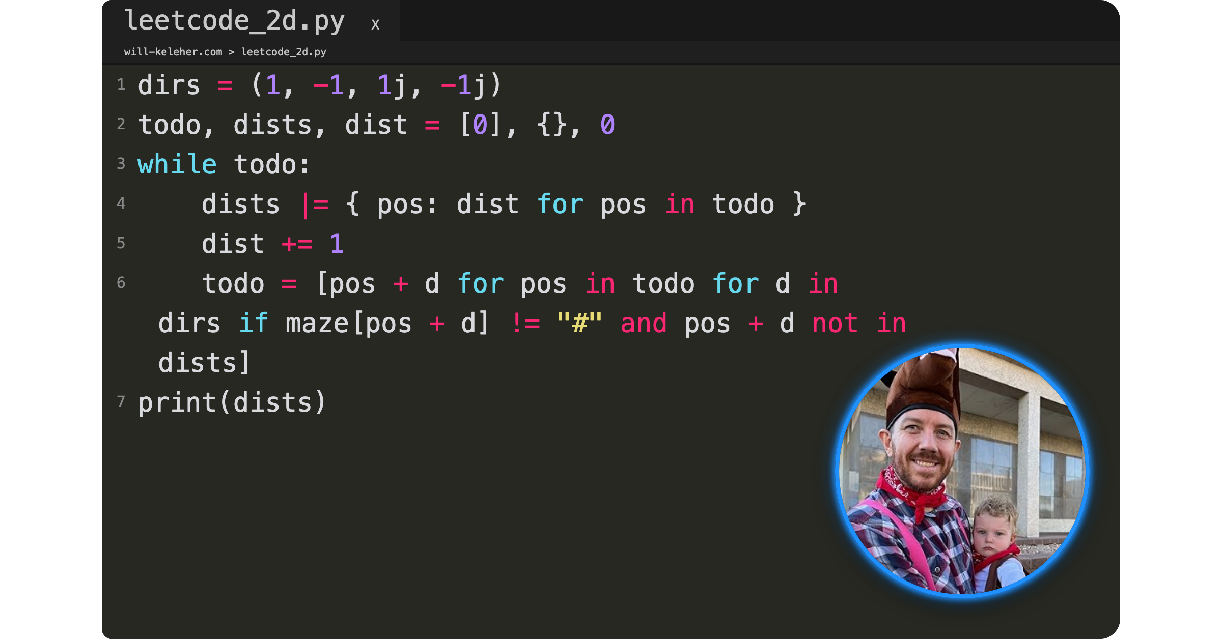
One distinguishing feature of a text editor is line-numbers, and I wanted to have some way of inserting those line numbers automatically. It took me longer than I’d want to admit to get things counting correctly, but the key piece was making sure the counter was happening in the code > span and not in the code > span::before. This is another spot where pseudo-elements are essential unless I wanted to do this with JS.
code > span {
  counter-increment: line;
}
code > span::before {
  content: counter(line);
  /* styles! */
}
Setting Up Image Previews using Puppeteer, Make, and CSS Transforms has a few more notes on how I automated taking these screenshots. I’m now using Just rather than Make and have switched to Hugo, but the important bits are still all there.
Animating a spider SVG
I still haven’t quite figured out how I want to integrate this spider animation into the mistwatch parts of my site, but I’m still pretty happy with how it turned out:
/* edited slightly for clarity */
.spider-piece {
  opacity: 0;
  animation: --fadeCycle 12s ease-in-out infinite;
  animation-fill-mode: both;
}

@keyframes --fadeCycle {
  0%  { opacity: 0; }
  10% { opacity: 0.7; }
  20% { opacity: 1; }
  50% { opacity: 1;}
  60% { opacity: 0; }
}
  /* center dot */
  #spider-37 {
    animation-delay: 0.1s;
  }
  /* surrounding */
  #spider-30 {
    animation-delay: 0.4s;
  }
  /* pedipalps */
  #spider-5 {
    animation-delay: 0.8s;
  }
  #spider-4 {
    animation-delay: 0.8s;
  }

/* a whole bunch more animation-delays... */
Bookify-ing my Book
Speaking of Mistwatch, if you look at EPUB cover of my book, it doesn’t look “booklike” in isolation:
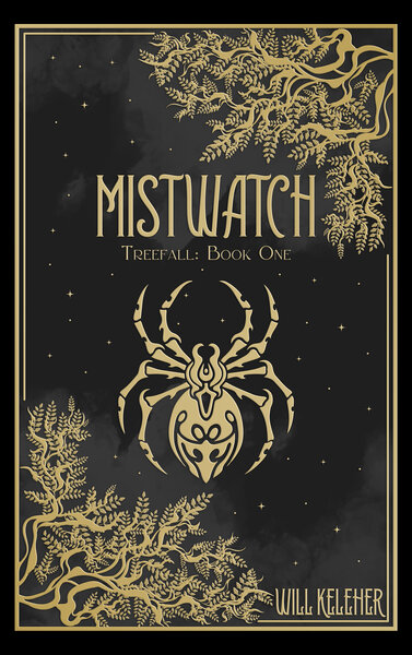
I wanted to make it look more like a physical book, and thanks to a helpful stackoverflow answer I’m now struggling to track down, I now have a version of the book with linear-gradients and inset box-shadows that make it look more like a 3D object.
.book-cover {
    background: linear-gradient(
      to right,
      rgb(0, 0, 0) 3px,
      rgba(255, 255, 255, 0.5) 5px,
      rgba(255, 255, 255, 0.25) 7px,
      rgba(255, 255, 255, 0.25) 10px,
      transparent 12px,
      transparent 16px,
      rgba(255, 255, 255, 0.25) 17px,
      transparent 22px
    ),
    url(/mistwatch/book_cover_600.jpg);
  background-size: 100%;
  box-shadow: 0 0 10px -2px black,
    inset -1px 1px 2px rgba(255, 255, 255, 0.5);
  border-radius: 5px;
  width: 375px;
  height: 600px;

}
There are many like it, but this one is mine
There are a ton of blogs out there with better styling than mine. There are a ton of hugo themes that I could yoink wholesale to make my site look more professional. And I’m sure that I’m doing some of these styles “wrong.”
But I like having my own little place that I get to tweak and change in whatever ways I feel like. I hope you have your own little place online where you get to play around too.